Posted on Leave a comment

Tips on how to design a business card

Tips on how to

Design Business Cards

design notes  |  compelling business cards

A good business card should convey the overall image of your business — not easy, considering the card measures only 2 inches by 3.5 inches. How can you possibly get a message across in such a small amount of space?

Some of our favorite tips:

  • Use your logo as the basis. Make it the largest element on the card.
  • Keep it simple. Do not cram too much information on the card.
  • Do include the essentials — your name, title, company name, address, phone and fax numbers, and email and website addresses.
  • Make sure the typeface is easily readable
  • Stick to one or two colors.

Once you’ve got business cards, make the most of them:

  • Always give people more than one card (so they can give it to others).
  • Include your card in all correspondence.
  • Carry cards with you at all times, in a card case so they’re clean and neat.

Source: http://www.entrepreneur.com/article/225962#

Posted on Leave a comment

Business card printing traps

Business Card printing traps

design notes  |  printing terminology

Having spoken with many customers over the years, and it is apparent to me that there are a handful of common pitfalls when using your own design files to print business cards.  We’ve boiled this down to the top 5 most common printing traps so no matter where you go for your printing needs, you will be armed with the knowledge necessary to optimize your print job.

1.  Pantone or Spot Colors

Consumer research has shown that accurate color reproduction is by far the most common problem throughout the printing industry.  The biggest culprit is usually the presence of Pantone or spot colors in your business card design files.  These are typically highly customized colors that fall outside of the industry-standard CMYK 4-color printing process.

CMYK is a process whereby thousands of colors can be created by mixing various percentages of cyan (C), magenta (M), yellow (Y), and black (K).  NexCards.com, as well as the VAST majority of printers in the market today, utilizes a CMYK process that is not compatible with spot colors.

A color shift often occurs when a CMYK business card printer attempts to print a spot color.  Stick with CMYK colors, or if you absolutely must have Pantone colors on your cards, attempt to locate a printing company that specializes in this.

2.  Black Backgrounds

A business card with a black background, if not set up properly, can turn out gray, blotchy, or over-saturated.  Luckily, this problem has an easy solution – simply convert the black background within your design file to a rich black. Rich black appears the same as any other black, but it is much better for printing purposes.

A black background consisting of 100% black (C = 0, M = 0, Y = 0, K = 100) will most likely produce unexpected results.  Instead, utilize a rich black, which incorporates other CMYK percentages into the mix.  Our preferred CMYK mix for rich black is C = 40, M = 30, Y = 20, and K = 100 for silk cards and C = 60, M = 40, Y = 40, and K = 100 for most matte and glossy cards.

3.  Borders

Artwork with borders is not recommended because a slight shift could occur during the trimming process.  This could result in uneven or off-centered border lines.

This shifting possibility is an industry-accepted standard so basically, any artwork containing borders is a bit of a gamble.  If you don’t like to gamble, remove the border from your custom business card files. Remember NexCards does full-bleed (borderless) printing and it’s wise to optimize your design to take advantage of this. Take your background right to the full bleed edge of the card.

4.  Too Many Enhancement Features

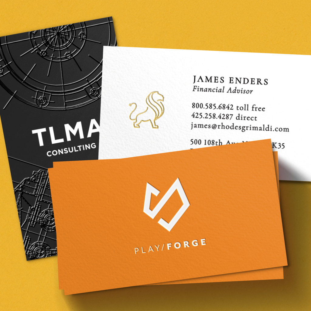
Spot UV, embossing, foil stamping, scoring, perforation, and other bells and whistles fall into the enhancement feature bucket.  Putting more than one of these features on a single card can cause flaws.  Spot UV could bubble, foil could flake, or embossing could become fuzzy.  It simply puts too much stress on the card stock.  Always stick with a single enhancement, my favorite of which is Spot UV.

5.  Hidden File Problems

Pay careful attention to the printer’s file specs.  Here at NexCards.com, we check every single file that is uploaded to confirm that everything is in-spec and print-ready, but I’m sure there are plenty of printers out there who don’t bother.

Hidden problems include things such as transparencies, overprint, and embedded fonts.  No matter where you go to have your business cards printed, always flatten your files, turn off overprint, and outline any embedded fonts.

Conclusion

Hiring a business card printer (especially us!) for your custom business cards is an excellent idea, and following my advice will eliminate 99% of any and all potential problems that might creep up during the production process.

Posted on Leave a comment

Enhancing your brand with business cards

Enhancing your brand

with Business Cards

design notes  |  compelling business cards

Business cards can be very effective to build a professional and thoughtful reflection of you and your company. You can make your business cards really appealing to valuable prospects; your business card will depict the core values of your company. Wonderfully presented information on quality business cards surely reflects well on your company’s integrity. Well presented business cards with your personal and corporate details can improve the way people see you by the professionalism displayed on the card. Your business card must be excellent quality to reflect good quality.

There are certain unique strategies through which you can make your business card effective and that will enhance your profitability:

Your business card is what you are advertising to other people. Advertising is all about making associations and building interactions. Using your business card is an influential and cost-effective way to do that. If you are designing a traditional business card, make sure to use both sides of the card. Give ample information so you can start making connections.

Some important details that can be helpful to you are:

  • Name
  • Testimonials
  • Information
  • Your mission and vision

Make sure it is apparent what you do. If your company has a creative name add a tag line or provide a list of services and solutions in the text on your card so that it becomes clear to the client what actually you are providing.

Make an impact and a long-term impression with your quality business card. You desire people to consider you and either keep your card handy or pass it along to a hot prospect. Exclusive colors and textures give fresh look and attract customers. There are also fascinating shapes and sizes but are careful not to get too large, the magnificence of business cards is that they are small and fit in a wallet.

Business cards are practical because they are an economical way to communicate the exclusive qualities that you are offering. Because they are trouble-free to hold and fit in your probable customer’s wallet, purse, or pocket and easy to pass to other people who might be seeking the same service that your firm is offering makes it valuable hence increasing your profitability

Make certain key information like your phone number, email, and website address are mentioned in your business card. It is also important to have your mailing address or cell phone on the card as well. Providing this basic information on your business card will be helpful for potential customers to interact with you when they need to.

Include your website address significantly on your quality business card. Your website is one of the most successful ways to build an association with probable customers.

It is important to add a logo to your business card. Your logo should be something interesting, something that calls attention to your business and marketing materials. This will help your clients remember you for a longer time.

Posted on Leave a comment

Getting the most from your custom business cards

Getting the most from

your custom Business Cards

design notes  |  compelling business cards

First impressions are everything, a fact proven over and over again by countless scientific studies. It is this basic facet of human nature that necessitates having a high quality, professional business card.

Because your business card is often the very first marketing piece given to your clients, it is critical that it represents you and your company in the best possible light. Whether you’re looking for silk business cards, glossy business cards, plastic business cards, follow the tips below for maximum positive impact.

Design Tip #1: Include Relevant Contact Details but Avoid Clutter

At a minimum, your business card should include your name, title, phone number, fax number, email address, and your company’s name, address, and logo. In addition, it’s a good idea to include a memorable and descriptive tag line that explains your position or what your company does. However, do not put so much information on your card that your message gets lost in a sea of clutter.

Design Tip #2: Consider Ways to Stand Out from the Crowd

There are many ways to make your business card jump out. For example, you could print your cards on premium cardstock – silk business cardssuede business cardsone of our deluxe, or even plastic business cards definitely stand out from the crowd.

Also, unique features like rounded corners, foil stamping, embossing, or spot UV are all terrific ways to differentiate your business card. One of the most creative examples I’ve seen is from an interior designer, who used a hologram to show a room before and after a redesign.

Design Tip #3: Keep Your Layout Simple

Always try to use a clean layout – white space is your friend because it facilitates easy reading. After your logo, your name should be the largest piece of information on your card, but make sure that all the information is printed in a large enough typeface to be easily readable.

Design Tip #4: Synergize with Your Company or Professional Image

Since your business card is an important part of branding, it should follow the same graphics standards as the rest of your marketing materials. Additionally, its look & feel should synergize with whatever image you are trying to portray.

For example, if you are an artist or designer, it is OK to use hip colors and non-traditional cardstocks such as metal business cards or plastic business cards. If you are a banker, a less flamboyant color scheme (blues, grays), and traditional cardstocks such as silk business cards or glossy business cards, will work better.

Design Tip #5: Have Them Professionally Printed

Finally, always have your cards professionally made by a printing company. Remember that your business card will be the first impression your prospects receive of your business, so do not skimp on this critical marketing tool.