Posted on Leave a comment

Tips on how to design a business card

Tips on how to

Design Business Cards

design notes  |  compelling business cards

A good business card should convey the overall image of your business — not easy, considering the card measures only 2 inches by 3.5 inches. How can you possibly get a message across in such a small amount of space?

Some of our favorite tips:

  • Use your logo as the basis. Make it the largest element on the card.
  • Keep it simple. Do not cram too much information on the card.
  • Do include the essentials — your name, title, company name, address, phone and fax numbers, and email and website addresses.
  • Make sure the typeface is easily readable
  • Stick to one or two colors.

Once you’ve got business cards, make the most of them:

  • Always give people more than one card (so they can give it to others).
  • Include your card in all correspondence.
  • Carry cards with you at all times, in a card case so they’re clean and neat.

Source: http://www.entrepreneur.com/article/225962#

Posted on Leave a comment

When black is not black

When black is not black

printing terminology

Modern offset printing with CMYK color is capable of presenting a kaleidoscope of vivid colors for exciting and memorable business cards. When it comes to black, care must be taken in their make-up so you get satisfactory results.

The difficulty begins when one of these formulas is used to fill in the background of a design. All black (K) 100%  in a large block may look pure black on-screen but when printed it produces a black that can best be termed grey-black.  The Photoshop default black is C = 75, M = 68, Y = 67, K = 90. This results in a total Ink coverage of 300% and that’s considered over-saturation. This can cause drying problems when sent to press.

Which black is best? There is no one agreed-upon formula but  C = 60, M = 40, Y = 40, K = 100 is often mentioned (and a favorite at Nexcards.com). Others prefer K = 100 combined with either Cyan or Magenta = 40.  All of these would be in the so-called “rich black” preferred by printers who want dark black without over-saturating the paper (and wasting ink). If in doubt, call the printer and ask what large scale black they prefer.

Don’t use the rich blacks for your text. The multiple ink passes could cause your fine text to look fuzzy and without detail. It’s better to use K = 100 only in most text.

Printers are familiar with the problem with some blacks and should kick out any of those problem cards. You can insure against an undesirable result by ordering from a reputable printing firm with a full customer service staff.

While we are speaking of colors, it’s best to begin your design in CMYK if possible.  We must submit work to print in CMYK only. Converting from RGB to CMYK can produce color hue shifts. It’s best for your designer to examine any possible color shifts and make adjustments if necessary.

Posted on Leave a comment

The brilliance of Akuafoil

The brilliance

of Akuafoil

compelling business cards  |  printing terminology

Instead of just putting silver or gold foil on a business card, imagine getting foil in full color on your business cards. Its dazzling radiance will definitely make your cards stand out from the crowd.  With Akuafoil, your cards can be foiled with half tones and gradients, and you can even have multiple foil colors in the same design!  The design possibilities are limited only by your imagination. Order your Akuafoil cards today!

Posted on Leave a comment

The reason for Full Bleed Printing

The reason for

Full Bleed Printing

printing terminology

NexCards prints full bleed. So do most other professional printers. What does that really mean? Is it a good thing and if it is, why? I’ll attempt to answer these questions and more.

Before the advent of full-bleed printing, photographs and other printed matter had a defined white border or margin around the perimeter.  You may have snapshots just like this in that old photo album if it goes back to the 50s and 60s. You can compare full bleed printed works to borderless prints, which started in the professional graphic arts studios and eventually migrated to the prints of that seashore vacation. The viewer assumes that the beach sand, the sky, or whatever forms the backdrop for the photo, goes past the picture ends for an indeterminate space.

So when you choose a printer that does “full bleed” that is the benefit that you derive.  This modern look has become the de facto standard for all but the very cheapest printing jobs.  When setting size standards, full-bleed printing firms require a certain over-sized design, typically for business cards either 3.75″ x 2.25″ or 3.625″ x 2.125″.  So the designer takes backgrounds, repeated artistic elements, or whatever else he or she wants to go to the edge of the card and takes those elements to the very end of the card design at this slightly enlarged format. In trimming, the perimeter is cut to yield a perfect 3.5″ x 2″ business card.

Well, almost perfect. The trimming process in off-set printing is still largely mechanical. Trimmed pieces are not always perfectly aligned.  Although it’s not a perfect analogy, imagine quickly pounding out dough shapes with a cookie cutter. But instead of a larger flattened dough area, you have to hit the mark on dough pieces precisely the size of your cookie cutter. Pretty hard to do, huh? It’s easier to do that on a larger piece than the cookie cutter.

High-speed cutting may drift almost imperceptible though a 500 or 1000 piece set. especially from set to set.  But when the design is full bleed, these very minor shifts (perhaps 1/16″) become imperceptible especially with the common once color background.  With a defined border (and we still get some of those submitted)  the tiny shift becomes more noticeable because you’re placing a “ruler” along the edges in the form of the border.

Be assured that your piece will always measure 3.5″ x 2″.  But to avoid unexpected results, we require compliance with two important parameters among our file specifications.  One, submit a full bleed design at the required over-size and keep wanted text will away from those edges. And two, do not submit visible borders or margins. Most graphics software will allow you to set up the over-spray size defined in our file specs. Only then will you be able to take advantage of the borderless look that is so in demand today.

Refer to our File Specs (file size/dimensions) for these and other specifications. Your printed project will go much smoother and faster if you follow these guidelines.

Posted on Leave a comment

What are silk business cards?

What are

Silk Business Cards

compelling business cards  |  printing terminology

When you choose a card stock, it pays to pick one that will leave a positive impression on clients. Silk business cards impart a luxurious elegance because they are so smooth and soft to the touch.

After the cards are cut, a microscopically thin clear laminate is fused on both sides of the card. The resultant silk business card is water resistant and tare resistant. Its smooth surface doesn’t hold smudges or other contaminants. The laminate coating, although undetectable, gives the card amazing strength. Technicians give the card a strength rating 250% higher than a regular matte card.

The matte surface lends itself to special effects such as spot UV (gloss) and reflective stamp foil. Nexcards offers premium silk cards in ultra-heavy 16pt.

Posted on Leave a comment

Business card printing traps

Business Card printing traps

design notes  |  printing terminology

Having spoken with many customers over the years, and it is apparent to me that there are a handful of common pitfalls when using your own design files to print business cards.  We’ve boiled this down to the top 5 most common printing traps so no matter where you go for your printing needs, you will be armed with the knowledge necessary to optimize your print job.

1.  Pantone or Spot Colors

Consumer research has shown that accurate color reproduction is by far the most common problem throughout the printing industry.  The biggest culprit is usually the presence of Pantone or spot colors in your business card design files.  These are typically highly customized colors that fall outside of the industry-standard CMYK 4-color printing process.

CMYK is a process whereby thousands of colors can be created by mixing various percentages of cyan (C), magenta (M), yellow (Y), and black (K).  NexCards.com, as well as the VAST majority of printers in the market today, utilizes a CMYK process that is not compatible with spot colors.

A color shift often occurs when a CMYK business card printer attempts to print a spot color.  Stick with CMYK colors, or if you absolutely must have Pantone colors on your cards, attempt to locate a printing company that specializes in this.

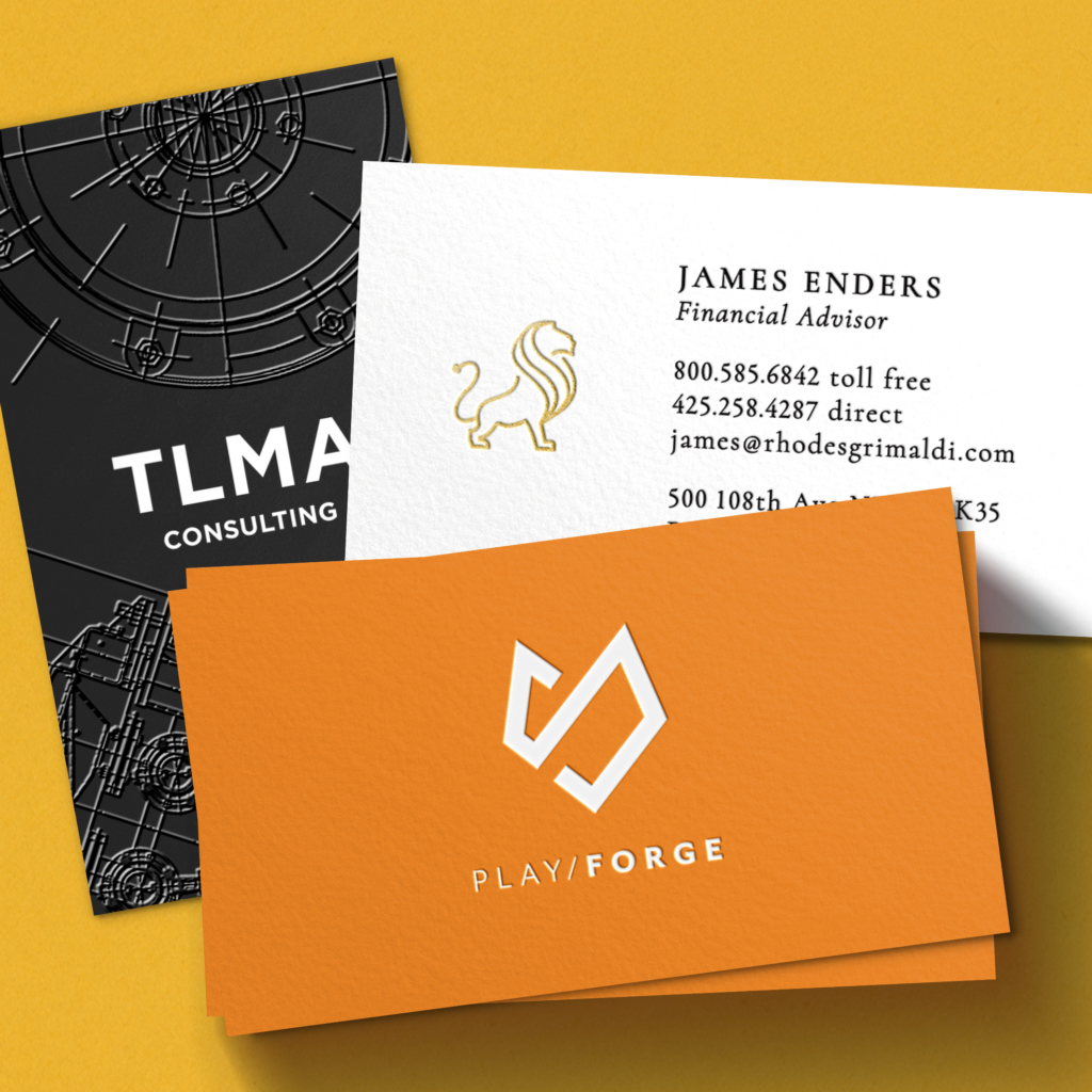
2.  Black Backgrounds

A business card with a black background, if not set up properly, can turn out gray, blotchy, or over-saturated.  Luckily, this problem has an easy solution – simply convert the black background within your design file to a rich black. Rich black appears the same as any other black, but it is much better for printing purposes.

A black background consisting of 100% black (C = 0, M = 0, Y = 0, K = 100) will most likely produce unexpected results.  Instead, utilize a rich black, which incorporates other CMYK percentages into the mix.  Our preferred CMYK mix for rich black is C = 40, M = 30, Y = 20, and K = 100 for silk cards and C = 60, M = 40, Y = 40, and K = 100 for most matte and glossy cards.
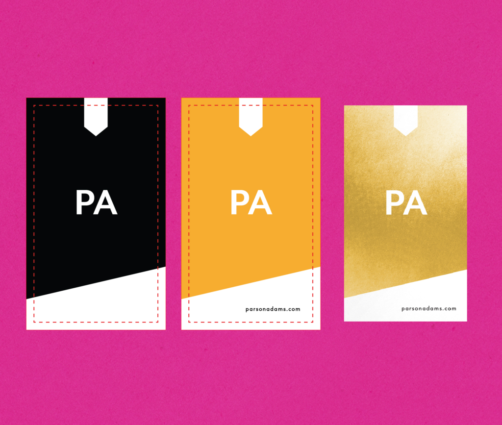
3.  Borders

Artwork with borders is not recommended because a slight shift could occur during the trimming process.  This could result in uneven or off-centered border lines.

This shifting possibility is an industry-accepted standard so basically, any artwork containing borders is a bit of a gamble.  If you don’t like to gamble, remove the border from your custom business card files. Remember NexCards does full-bleed (borderless) printing and it’s wise to optimize your design to take advantage of this. Take your background right to the full bleed edge of the card.

4.  Too Many Enhancement Features

Spot UV, embossing, foil stamping, scoring, perforation, and other bells and whistles fall into the enhancement feature bucket.  Putting more than one of these features on a single card can cause flaws.  Spot UV could bubble, foil could flake, or embossing could become fuzzy.  It simply puts too much stress on the card stock.  Always stick with a single enhancement, my favorite of which is Spot UV.

5.  Hidden File Problems

Pay careful attention to the printer’s file specs.  Here at NexCards.com, we check every single file that is uploaded to confirm that everything is in-spec and print-ready, but I’m sure there are plenty of printers out there who don’t bother.

Hidden problems include things such as transparencies, overprint, and embedded fonts.  No matter where you go to have your business cards printed, always flatten your files, turn off overprint, and outline any embedded fonts.

Conclusion

Hiring a business card printer (especially us!) for your custom business cards is an excellent idea, and following my advice will eliminate 99% of any and all potential problems that might creep up during the production process.

Posted on Leave a comment

Durable and Different Plastic Business Cards

Durable and Different:

Plastic Business Cards

compelling business cards  |  printing terminology

f you are looking for something different in business cards, consider plastic business cards. They are the most durable of business cards and won’t rip, stain, or exhibit wear.  Here we examine the three types of plastic cards for sale on NexCards.com.

Clear: This card is perfectly clear. Drop it on the floor and you might have a hard time finding it. This card we print is 20pt (.020 inch). The average cardstock is 14pt and a credit card is 30 pt so our plastic cards are comfortably between. There is no white background as we don’t print white (white is no ink in the CMYK color spectrum). This card benefits from high contrast elements with bold color. Be sure to leave plenty of open background so natural light can shine through to “light up” the card. Black text is the clearest to read.

Frosted: Frosted plastic is more easily seen than described. See the image. The card is not transparent but translucent. Like the clear card, white does not print and bold coloring with an open background looks best. You can simulate white/silver by using a light grey (C=0, M=0, Y=0, K=30).  This card and the clear allow printing on one side only

White: These cards are matte white on both sides. As these are not transparent, you can print on both sides. NexCards has these in the popular 20pt weight. Rounded corners are standard ( as are the Clear and 20pt Frosted cards). These cards will appear much like on cardstock. Colors will be vivid and smaller pastels or fancy type will be immediately discernible.  This the safe choice if you want plastic but the other card types make you nervous as to the result. If that is the case, fill out the samples form and to receive samples of plastic cards.

NexCards offers plastic at cardstock prices. Go here to learn more about plastic business cards and prices. Click “Get Started” to hone in on the details.

Posted on Leave a comment

Magnetic business cards for extended exposure

Magnetic Business Cards

for extended exposure

compelling business cards  |  printing terminology

Magnetic business cards are an inexpensive marketing tool that never quits working for you.  Rather than just another card stuffed into a wallet, magnetic business cards typically wind up on a refrigerator. The American Association of Advertising Specialties (AAAS) states that the average refrigerator magnet is viewed 23.4 times per day. That makes the magnetic business card one heck of a communication tool! These durable cards are much harder to just throw away. You can count on the extended exposure to benefit your business in the long term.

Hand out these magnetic cards at trade shows, business meetings, open houses, product launches, and professional appointment reminders. Our cards use a full sheet of magnet, not the small dots you see on some other cards. These will stick to anything magnetic, like filing cabinets, metal doors, lockers, and some auto surfaces. We offer full-color printing on a durable 17pt magnetic stock.

Posted on Leave a comment

The high-impact special effects of foiling and embossing

The high-impact special effects

of foiling and embossing

compelling business cards  |  printing terminology

These are some of the most striking special effects you can add to your card. Foiling, sometimes called foil stamp or hot foil is a technique where the actual foil is laid upon a design element or text resulting in a shimmering reflection. It’s quite dazzling in the light! Common colors are silver and gold. In certain cases, we can do other colors.

A new twist on traditional foil stamping is called Akuafoil. In this technique we lay down a reflective disc and print on top of it. This allows us to foil all the colors in the CMYK color spectrum! So we can match the color on your artwork. Gradients and multiple colors is no problem with this technique. We do caution you again to stay away from too small print.

Embossing is an effect that pushes your chosen printed area from the back to raise it beyond the card surface. You’ve seen this on notary seals and the numbers on your credit card. A design shape or logo is a frequent target for embossing. The raised surface is one height and again avoid using thin fonts and thin lines. An embossment of a foil can be done under certain circumstances.

Typically these techniques are done on one side of the card. If your foil stamp is gold or silver, we can do both sides of a 16p silk card. An embossed business card is usually only one side because the back of the card will show the reverse of your embossment. Because these are delicate processes, we recommend you send us your file through email before ordering.  Let us know what you want to do and we’ll tell you what is feasible.

Posted on Leave a comment

The beauty of raised spot uv business cards

The beauty of

Raised Spot UV Business Cards

compelling business cards  |  printing terminology

To define a raised Spot UV business card, we first need to discuss Spot UV business cards in general. In this technique, we highlight customer-defined design elements and apply a gloss to those elements. For the best overall look and feel, we do this on a matte high-end silk laminated card. This way, we have a quality effect done on a custom card stock.

The “UV” stands for ultraviolet. This wavelength of light is used to cure the varnish which results in a very high gloss. Typically, these effects are done on logos or company names. Occasionally a customer may choose other elements, such as the name or title.

An interesting effect can be achieved by using spot UV in a pattern on the background of the design. Various honeycomb effects are becoming more common as more customers learn about the benefits of using Spot UV on their business cards, postcards, or brochures.

There are two types of Spot UV, flat and raised. Flat UV is just that, glossy but not raised above the surface of the cards. It can be added to a number of our business cards and marketing materials. Alternatively, you can order Raised Spot UV which is slightly raised providing an extra dimension and enhanced sparkle.